
Jake, an average internet user looking to switch his insurance provider, landed on what seemed to be a reputable website
Once Upon a Homepage: The Beginning of a UX Disaster
It all started with good intentions.
Jake, an average internet user looking to switch his insurance provider, landed on what seemed to be a reputable website. The homepage was flashy. Buttons blinked. Images slid across the screen like an expensive commercial. But within 30 seconds, Jake was frustrated. The call-to-action buttons contradicted each other. “Start Now” led him to an FAQ, and “Learn More” opened a registration form.
It wasn’t long before Jake clicked the back button forever.
The brand just lost a potential customer, all because of poor user experience. And it’s far more common than businesses think. What Jake experienced is what UX professionals call a navigation nightmare one of the top conversion killers in digital interfaces today. This brings us to the hero of this tale: the ux assessment.
What Exactly Is a UX Assessment?
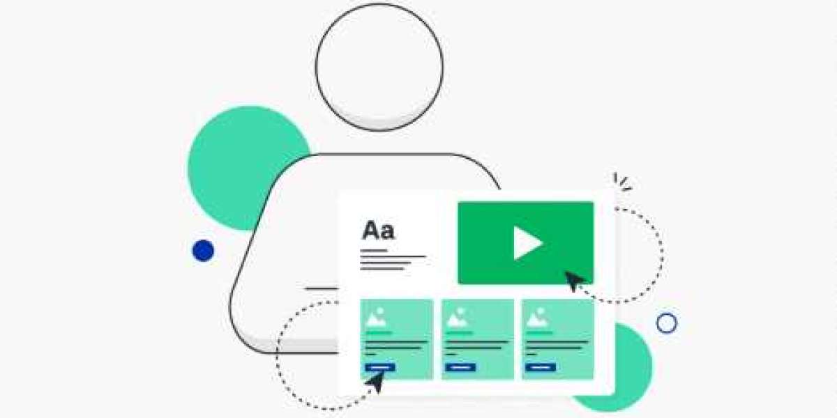
A UX assessment is not a casual review or a designer’s opinion on a layout. It’s a structured, research-backed audit of how users interact with your product—from finding the homepage to achieving their goals (sign-up, purchase, subscription, etc.).
Think of it as a diagnostic scan that evaluates everything affecting user behavior: page speed, hierarchy of content, clarity of calls to action, emotional triggers, friction points, and more.
UX assessments go beyond visual appeal. They investigate psychological cues, behavioral loops, and the digital pathways that users traverse. If Jake had landed on a site that passed a proper UX assessment, he wouldn't have gotten lost. He would’ve converted.
How Navigation Nightmares Destroy Conversion Rates
Poor navigation is like bad signage in a labyrinth. Users don’t know where to go, what step comes next, or how to backtrack. Every moment of hesitation equals cognitive load, which leads to abandonment.
During a UX assessment, professionals look at micro-interactions like hover states, scroll depth, rage clicks, and session recordings to determine friction zones.
Jake’s behavior wasn’t random. It followed a predictable pattern a pattern that a solid UX assessment could have identified and fixed. Instead, that brand failed to map the user's journey and lost out on revenue and trust.
What Happens in a UX Assessment?
At the process of a UX assessment includes:
Heuristic evaluation based on best practices.
Behavioral analytics (heatmaps, session replays, funnels).
User testing with real participants.
Content and accessibility audit.
Conversion path analysis.
Each stage is designed to uncover invisible barriers that users face.
From a Semantic SEO lens, every step of a UX assessment aligns with contextual understanding. Just like Google strives for Relevance and Responsiveness, UX aims to meet user intent with clarity and speed. UX isn’t about decoration—it’s about direction.
Why UX Assessments Matter More Than Ever
We live in a world of topical authority and search experience optimization (SXO). Google has evolved from ranking pages based on keywords to evaluating how users engage with content. Dwell time, bounce rates, and even mouse hover patterns are becoming subtle signals in the algorithm.
So, when your UX is poor, you’re not just losing customers like Jake. You’re also damaging your organic rankings.
A proper UX assessment ensures your website aligns with both user psychology and search engine expectations. It supports macro-semantic alignment (what users expect) and micro-semantic clarity (what they see, feel, and act upon).
Real-World Impact: From Nightmare to Dream Flow
Take the case of a fintech startup that approached ReloadUX. Their bounce rate was 78%. After a thorough UX assessment, we found:
Critical CTAs hidden below the fold.
Redundant steps in the sign-up process.
Confusing navigation terms (“Dashboard” used for four different features).
After restructuring based on UX assessment insights, the bounce rate dropped to 42%, and conversion increased by 68% in three months.
They didn’t change their offer. They just made it findable and usable.
FAQ: UX Assessment Demystified
Q1: How long does a UX assessment take?
A: Depending on the website size and user complexity, a typical UX assessment ranges from 2 to 4 weeks.
Q2: Is a UX assessment the same as a UX audit?
A: They are often used interchangeably. However, an audit is generally broader, while an assessment may focus on specific journeys or pain points.
Q3: Can small businesses benefit from UX assessments?
A: Absolutely. In fact, for SMBs, a UX assessment often leads to quick wins with outsized returns.
Q4: How do I know if I need one?
A: High bounce rates, low conversions, user complaints, or inconsistent engagement are clear signs you need a UX assessment.
Conclusion: Map Before You Build
Jake’s story is a warning but also a lesson. Users want to be guided, not lost. A UX assessment is the map. Without it, you’re guessing. With it, you’re optimizing.
Brands that invest in UX don’t just retain users—they build loyalty, reduce friction, and increase conversions. UX is not a luxury; it's a necessity in the semantic web where every click, hover, and pause is a data point.